
Push Sync
We’re very excited to announce that for the very first time, 2Do will include support for transparent, background Push Sync. In simpler words, making a change on one device will (almost) immediately sync all of your other devices, transparently in the background. You no longer will have to rely on iOS to (in)frequently sync 2Do in the background, or wait for changes to appear after you’ve launched the app, including app badge updates. This will work irrespective of which sync method you’re currently using, giving you the freedom to pick whatever sync method you prefer, including your very own CalDAV server (unlike other apps that force you into using their custom cloud storage just for this one feature to work). How amazing is that?
This new feature is at first going to be available for all iOS devices, starting with v3.6, and will later be extended to support Mac OS X. Push Sync will not only result in rapid sync, but will also extend the battery life of your devices as it’s going to be a lot more energy efficient.
There will be no switches to toggle, and no settings to mess around with – it’ll just work after you update to v3.6. In fact, you won’t even notice it, except your other devices won’t show you stale data at launch anymore. It’s that cool!
Update: v3.6 is now available on the App Store!
Watch 2Do in Action
For all our existing and new users alike, we’re happy to announce that 2Do for Apple Watch is ready. As you all are probably aware, Apple Watch will be available to pre-order starting the 10th of April and should be in your hands on the 24th. We’ve made sure you’ve got one more reason to buy that watch!
2Do for Apple Watch is going to be a natural extension to the app on your iPhone, iPad and Mac. If you happen to be aware of the subtleties and limitations involved in developing for Apple Watch, you’d appreciate that we went all-out on getting this ready for you. Instead of dumbing down the app in the spirit of we wanted to keep it simple, our team took up the challenge and developed a truly remarkable companion app – one that you’ll actually want to use.
2Do on the Watch will give you direct access to all your popular lists, including a hand-picked list. This could be anything from a simple list to a Smart List built around a complex set of rules. You’ll immediately be able to familiarize yourself with the task list layout, as it has been designed to resemble the main app. Additional information regarding dates and times will be displayed where possible. If you’ve got the habit of organizing your tasks into projects and checklists, 2Do’s got you covered. It’ll let you dig deeper into the list hierarchy and access all your sub-tasks, so you’ll never have to take out your phone again when shopping… unless of course you want to.
We didn’t leave the task details screen out either. At a glance you’ll get all the relevant details assigned to the task, such as start dates and due dates, durations, tags, locations or actions; and a simple swipe to the left takes you to all your notes. Beautiful.
You’ll also have the option to schedule or delete your tasks directly from this screen.
2Do for Apple Watch will be making its way through the App Store and onto your wrists as soon as Apple begins accepting 3rd party apps, which we’re hoping will be around the launch date: 24th of April, 2015.
Info Zooming
If we haven’t already emphasized this enough, allow me to reiterate: our goal and aim is to make 2Do amazingly intuitive on the iOS devices and thus support desktop-class task management on the smaller screen sizes without burdening the user with a ton of options. 2Do has already accomplished great feats on the Mac and now it’s time to bring some of this to its smaller counterpart.
Allow me to however point out a problem we’ve had with earlier versions of 2Do, and based on some initial feedback from our public preview of v3, a more elegant approach was needed. For a number of years now, 2Do has supported various customizations that allow you to optionally toggle certain things on and off, such as the display of list names, notes, indicators and so on. This worked, except in situations where one wanted to quickly zoom into the task and see more information without having to toggle those options ON or OFF again.
Many times, for example, you would want to only look at the titles of your tasks to get a gist of what’s due today without having to go through multi-line titles, assigned tags, notes, list names etc – clutter that you don’t want. But then at times you would want to quickly get an overview of all your tasks along with their assigned tags and notes when performing a lengthy review of your tasks to determine which one deserves to be embarked upon next.
This selective information density zooming has not been possible, until now. To begin with, we initially solved the problem of selective zooming by allowing users to be able to enter, what we call, Extended Mode. Tapping the priority / down-arrow button next to the title would immediately expand the task and show all details at once, including tags that you had assigned. In other situations 2Do would show one to two lines of titles, where possible, along with a preview of assigned notes. Great, problem solved.
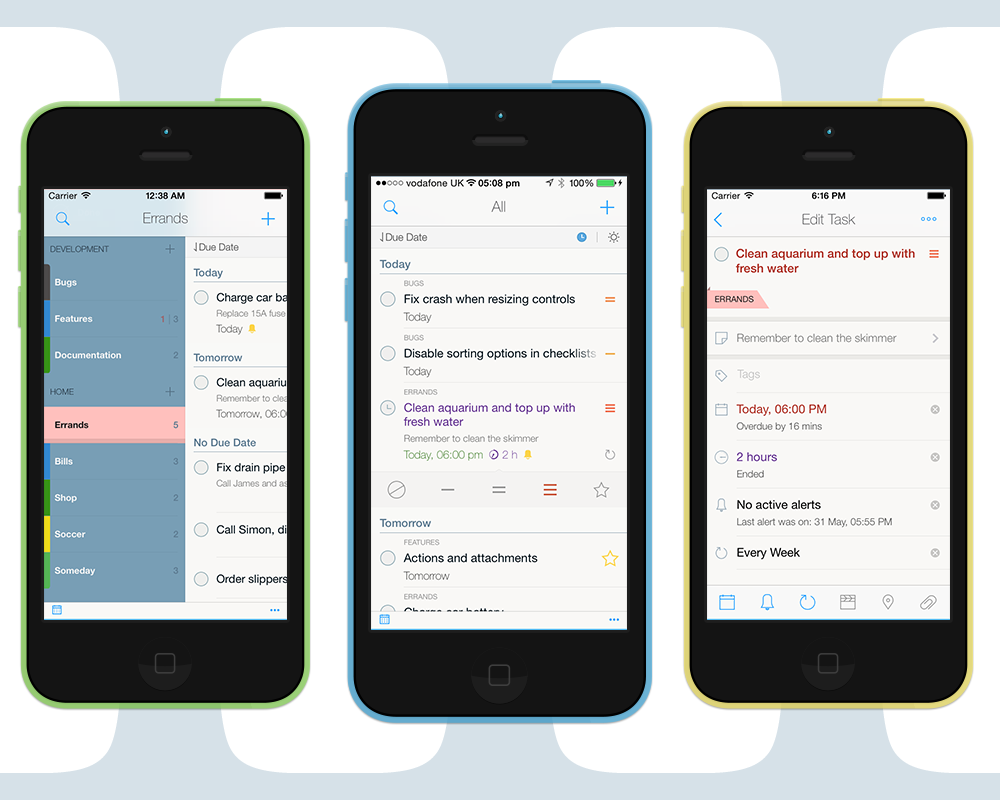
Not entirely, though. The second problem was the ability to selectively do this for all visible tasks in your list, without having to go through various toggle options in settings. Allow us to introduce to you: Pinch Info Zooming.
2Do v3 will support a simple pinch-to-zoom gesture, allowing you to move between three display modes: Compressed, Normal, Extended. As the names suggest, in Compressed you’ll only see task titles and dates. In Normal you’ll see titles, dates, notes and list names (where applicable), and in Extended you’ll see it all, all in one go – including multiple assigned tags.
We hope to make 2Do enjoyable, intuitive and easy to use, not to mention improve upon the vast usability options 2Do first introduced. Enjoy the demo.
Jun 30, 2014
Ta-da
We’ve finally come out of the woods and felt it’s about time we publish an update on what we’ve been doing, what’s coming next and what’s so exciting about this next big update? Today, folks, is the long awaited ta-da moment.
They say pictures speak louder than words. Maybe not so much for this post in question. The glaringly obvious visual changes, design language and UI elements is there, but what it can’t tell is how amazingly tangible it now is. That’s what this update has been all about. We kept improving it till there was, for now, no more room left for improvement. Everything is more fluid in every way imaginable. Don’t take our word for it, see for yourself:
What’s New
Everything – including the stuff that was already there before. It’s new. The underlying code is new, the way you’d interact with it is new, the way tasks get updated, added, deleted, moved, dragged; from tabs to tasks to tags to editors – we literally dumped all the previous code ever written and re-wrote it from scratch. That took a lot of time, but boy are we glad we took this route. It opened up ways to new things, new ideas and new ways of doing the same ol’ stuff.
2Do has always had this unique look and feel about it, including its ability to offer everything under the Sun without compromising ease of use. The list tabs that we all love, as well as the several different intuitive ways you’d go about managing your stuff. The core ideas it evolved with over the years were all great. We wanted to retain all the goodness and improve upon the core. Our journey involved working on new ideas as well as porting proven ideas and concepts from our Mac app, ideas that earned it the ‘Best of 2013’ title on the Mac App Store. Without further ado, let us delve straight into some of these. Bear in mind though, this post is in no way an expansive overview of what’s to come. This is merely a glimpse of what to expect – a very thorough glimpse to say the least.
The Three Ts (Tabs, Tasks, Tags)
Up until now, the ability to move rapidly between your lists, tasks and tags was only possible on the Mac, thanks to the amount of screen real-estate you inherit. We’ve explained in a previous post how Tabs make our lives easier, by allowing us to switch context easily and effectively; something that we believe is vital when it comes to being productive. Our recent update for the Mac showed that people fell in love with Tags, all over again. It boiled down to mainly one thing: the ability to quickly and effectively reach out and access tags in between your usual workflow, so you could find stuff quicker, and the quicker you find them, the quicker you do them.
Tags have been part of 2Do for numerous years, but it’s the first them ever that we’re bringing them out in the open; access them as you would on a Mac, right next to your tasks. A single swipe gesture and you’re in in Tags. In an instant, know which tasks are tagged, known which ones aren’t, and find and act upon those that are. It’s simple, beautiful and you’ll love it. [···]